
RETECHNOLOGY PREMIUM MARKETPLACE RELATED PRODUCTS | WEBINARS | SPECIAL OFFERS


You are viewing our site as an Agent, Switch Your View:
Agent | Broker Reset Filters to Default Back to List7 Ways to Simplify Your Real Estate Website to Increase Lead Generation
October 08 2020
 Marketing and psychology go hand in hand. As a real estate professional/marketer, you've probably asked yourself why consumers behave a certain way or why someone does the things they do. For example, a lead that doesn't do research because they rely on you, an inspector that misses the attic because it's probably good, or an agent that doesn't persistently follow up with a lead because it isn't good. Many of these behaviors are caused by human's natural tendency to choose the path of least resistance. People want to take the easiest route that uses the least amount of thinking and energy.
The consumer's natural tendency to choose the path of least resistance is the primary reason you must simplify your website. A visitor wants an easy, streamlined experience that quickly delivers the information they desire. They want minimal clicks to navigate through your website and minimal scrolls to view information on a page. By simplifying your website, you can reduce the amount of noise and distractions so the consumer can focus on their goal and you can deliver the information they came to your website for—which increases your chances of converting them into a lead.
In this article, I will share seven ways to simplify your real estate website to enhance the user's experience and increase your lead conversion.
1. Keep Essential Features of Your Website that Provide Value
Each page on your website must have a purpose and goal that provides value and/or meets a visitor's needs. For example, the purpose of a listings page is to promote listings and the goal is to have a visitor schedule an appointment to see it in person. If a page doesn't have a purpose or a goal, then it shouldn't exist on your website. A page that has a purpose, a goal, and is valuable to the consumer is more likely to convert visitors into leads. So what does the average consumer look for on a real estate professional's website?
According to NAR's 2018 Profile of Home Buyers and Sellers report, the top ten most popular website features that home buyers valued were:
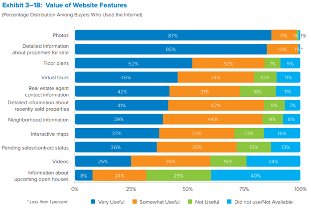
(Source: NAR's 2018 Profile of Home Buyers and Sellers report)
Based on the chart above, the Listings page and the Home Search pages are the most important pages on your website because they contain the information that consumers find most valuable: photos, detailed information about properties for sale, floor plans, virtual tours, videos, and information about open houses. Next are the Community/Neighborhood pages. Then Past/Current Listings page. Finally, your About page. If some pages are similar, consider consolidating them so that all the information is comprehensive, is easy to find and in one location.
2. Remove Unnecessary Website Elements
If a page on your website doesn't provide value to your visitors or it doesn't get a lot of traffic, get rid of it. Unnecessary elements on your website is noise that distracts the visitor from their goal and your goal on your website, increases loading times, and diminishes the user's overall experience. All of these can cause a visitor to leave your website.
Differentiation between elements that are nice to have versus necessary is a challenge. It might even that spark hoarder-type behaviors, making it impossible to relinquish any semi-useful elements. If this happens, keep your goal in mind: to reduce noise and distractions so the visitor gets the information they need and converts into a lead. If you remove an element from your website, you can always deliver it to a lead via email or other mediums.
Some elements that you might consider removing from your website are:
- Mortgage calculators – you can deliver this tool later
- Reviews page – a visitor will most likely schedule an appointment if you have the right listing, then check your reviews if they're seriously considering you
- Pages that offer some value, but aren't comprehensive. For example, a Buyer's page with a short buying process summary but doesn't provide a lot of value. You can increase the value by consolidating relevant information like a home buyer's packet download, your home search, and other valuable information for home buyers.
3. Reduce the Number of Pages on Your Website
Based on the information in section one, the most valuable pages on your real estate website are, in no particular order: Listings page, Sold/Pending/Contract Listing Pages, Home Search page, Neighborhood Information Pages, and your About page – a Comparative Marketing Analysis page/tool falls under the Detailed Information About Recently Sold Properties category. That's six pages! Six pages that have implicit purposes, goals, and provide valuable, relevant information to visitors. Six pages that are designed to convert traffic into leads.
By consolidating relevant information or reducing the number of pages on your website, you can streamline and enhance the visitor's experience by delivering the information they desire quickly.
4. Stack Content and Information Above the Fold
Think of "above the fold" like a newspaper, but for your website. When a consumer sees a newspaper on display for sale, they see the content that's above the fold. This content is captivating, clear, concise, and allows the reader to consumer the information quickly – within a blink. The Blink Test is used to optimize websites and enhance the user's experience. When a visitor lands on your page and sees your "above the fold" content, they should be able to determine the purpose, goal, and the value provided within a blink. If your page doesn't communicate this, it doesn't pass the blink test.
Many of your essential pages are probably already designed in this manner, but reassess them and check if the most important information and content are above the fold and that the page's purpose and goal are blatantly obvious to the average consumer.
5. Use No More than Three Theme Colors for Your Website
Your website's color palette shouldn't contain more than three different colors at most—black, white, and gray are not considered colors in this situation. You need a primary color for information like headers, titles, and buttons as well as an accent color that complements the primary color—used for highlighting information and links. For our website, the primary color is purple, and the accent color is blue. Any more colors could be obnoxious to your website visitor. Look at other brokerages—most of their logos and websites are either one or two colors. Why? Because simple is better!
6. Remove Drop-down Menu Items and Reduce Menu Options
Too many options can turn off consumers; it's called "overchoice." Since the goal of simplifying your website is to reduce the amount of clicks the visitor must take to get the information they desire, consider reducing the amount of menu options and drop-down items on your website. If menu items are stacked in a drop-down format, consider consolidating them.
For example, a Local Reports menu item could have many items in its drop-down menu like a community reports page, a school reports page, a points of interest page, and a local market reports page that can be consolidated into one page.
7. Format, Structure, and Space Your Website for Scalability
The average consumer has the attention span of a goldfish—eight seconds. Plus, readers love to skim through information, which means your website must deliver information quickly through formatting, structure, and spacing. Use headers and sub-headers to divide information and highlight important topics. Additionally, bolding to help readers locate important words and phrases, bullet points to breakdown run on sentences, and more.
When it comes to your real estate website, less is more. When your website follows this motto, each page has a purpose, goal, and is relevant to your target audience. It streamlines your visitors' experience by delivering information quickly, easily, and with minimal distractions. To simply your real estate website, keep only the essential elements, consolidate pages with relevant information, stack content above the fold, limit theme colors, and use formatting, structure, and spacing to make information scannability and easy to digest. When a visitor has a good experience on your website, they are less likely to leave and more likely to convert into your lead.
To view the original article, visit the TorchX blog.